
This week I managed to find some time to get out for a few hours in the Southern end of the Scottish Highlands. Loch Turret is a reservoir that sits just above Crieff. it’s a beautiful location and one that I plan to revisit a lot once we get in to Autumn and Winter.
It’s a place where the solitude and natural beauty really speak to me. It feels like the Scottish Highlands that my mind goes to when I look back on my younger years. Wild hills, huge bodies of water and the feeling that this place belongs to nature and not to us. You can see the video I shot there this week below.
But I thought it would be interesting to break down a few of the photos I took there during the harsh mid day light to see what worked, what didn’t and give an insight in to how I work. Firstly, a bit of context as to why I shot how I did. I chose black and white for the majority of shots, only switching to color when I felt the color actually added something to the photo. I find myself predominantly working in black and white these days, those of you who have read my previous articles will know why. I still see the beauty around me everywhere, but it feels tainted by at the moment. I’m trying to work through that and photography, as always is my crutch.
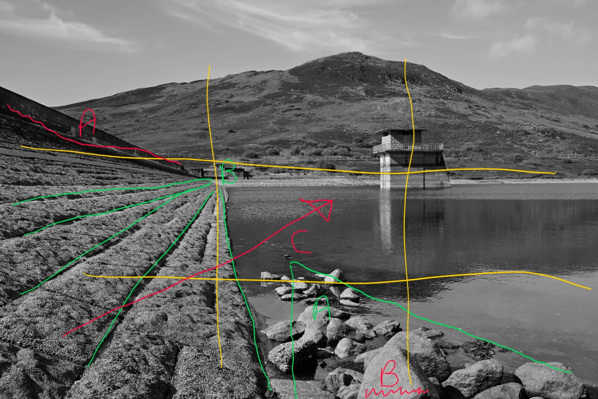
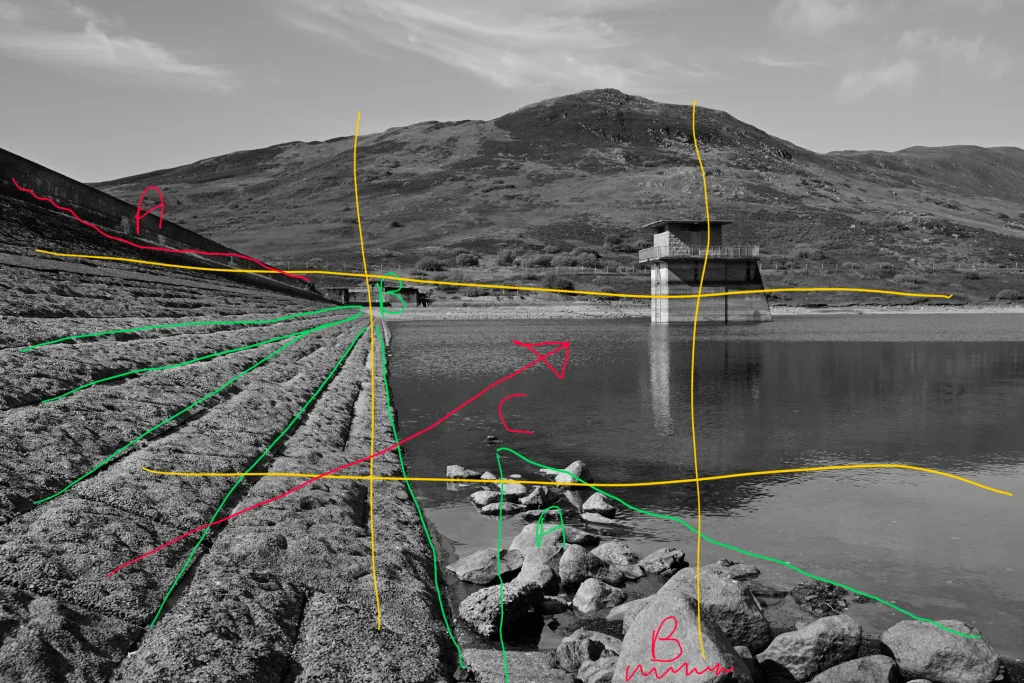
Let’s start out with this black and white shot of the dam wall and water tower at Loch Turret. I’ve marked up the photos. Green are the things that work well, yellow shows the compositional guide such as the rule of thirds or golden ratio and Red highlights the problems or mistakes.
Lighting & Exposure
The harsh light creates shadows that help add depth, particularly in black and white images. The overall exposure works well, with one caveat to come later.
What Worked Well
- Green A: I Positioned myself and composed the image to create a triangle shape from the rocks pointing further into the frame, helping to draw the eye through the photo.
- Green B: I Used the dam wall to create strong converging lines that draw the eye deeper into the photo.
- Yellow: The main subject is placed on one of the intersecting lines using the rule of thirds, giving it prominent attention and balancing the photo. It is placed on the opposite side of the dominant dam wall to help achieve balance.
Room for Improvement & Critiques
- Red A: The top of the dam wall was in deep shadow; even after lifting the shadows, it remains slightly distracting and draws the eye away from the main elements. The positioning is also uncomfortable, running into the photo about 3/4 of the way up from the bottom, which throws off the geometric balance.
- Red B: The rock is cut off so doesnt sit naturally, neither fully in the frame, nor removed entirely.
- Red C: Although the converging lines of the dam wall draw the eye deeper into the image, ideally they would have run toward the water tower.
Conclusion
- Overall, I like the photo, but with a little more thought and time, perhaps I could have lined up the elements in the scene to work even better together to create a stronger, more focused composition.
Loch Turret: The First Frame That Didn’t Work
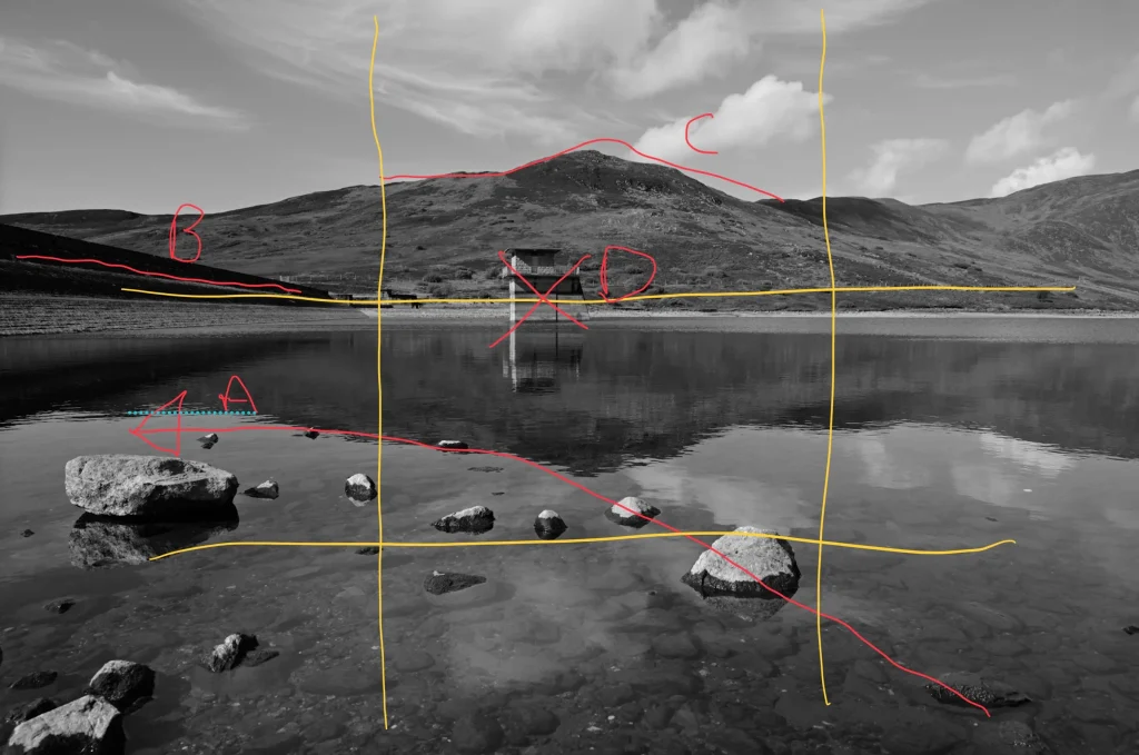
This was the opening shot in the video, and I knew right away that it simply didn’t work but as I was in position for the video clip, I took it anyway. Rather than trying to force it, I moved positions, but it’s worth looking at why this composition fell flat:
- Red A (The Rocks): The foreground rocks are naturally drawing the eye away from the subject (the water tower) and dragging it toward the dam wall instead.
- Red B (The Dam Wall): While the dam wall is less prominent here than in other frames, the deep blocked shadows and awkward placement still pull the eye away from the rest of the scene.
- Red C (Mountain Peak): The highest peak of the background mountain sits dead center in the frame, creating imbalance.
- Red D (The Water Tower): The main subject is stranded in “no man’s land.” It isn’t centered with intent to anchor the frame, nor is it placed on any of the rule-of-thirds intersecting lines to create balance.
There are no green notes on this one—sometimes a composition just doesn’t work.

This is the frame I shot after trying to build a composition that worked better than the first image. When I’m shooting, I tend to instinctively recognise the issues without consciously diagnosing them right away. This image works much better than the first and feels significantly more balanced.
- What worked:
- Green A (Foreground Rocks): I positioned myself and framed the shot so that the foreground rocks converge directly toward the main subject (the water tower).
- Green B (Mountain Ridgeline): The background mountains now feel balanced, with a natural flow from left to right that leads your eye to explore the hilltops. Their placement feels right, with enough sky above them to provide proper environmental context.
- Green C (The Dam Wall): The dam wall that caused issues in the previous photos has now been minimized by the angle of the shot, removing it as a heavy, distracting element.
- Yellow (Subject Placement): The main subject is now placed purposefully, allowing the eye to come to a natural rest on it after being led around the various elements of the frame.
- The Trade-Off: In an ideal world, the subject could feature more prominently by being larger within the frame. I could have achieved this by using a longer focal length to compress the elements together, but doing so would have made it impossible to include the foreground rocks in the same way. Every shot is a compromise and a balance.
All of the photos here, and in the video are completely uncropped in post. I tend to prefer to try and get things right in camera but of course, if you get back home and can see an issue, sometimes the resolution of the Nikon Z8 can help out and allow you to crop distracting elements out of the frame. What it can’t do is change the position of elements, relative to each other after you’ve taken the shot.